
Why your next hire is reading your brand
How five clients used a rebrand or new website to fix their recruitment problem
There is a pattern we keep noticing on the Sunshine Coast and beyond. A business calls us about a brand refresh or a new website, and somewhere in the first conversation the real reason surfaces. They cannot find the right people. Or they keep losing the ones they have.
It rarely starts as a recruitment brief. It usually starts with something more familiar. The logo feels tired. The site is held together with workarounds. The capability statement looks nothing like the proposals. But push a little further and the through line is the same. The team is growing, retiring, or being poached. And the brand is not pulling its weight in the hiring process.
Good people research before they apply. They visit your website. They look up your LinkedIn. They ask around. If what they find feels dated, vague, or stitched together, they keep scrolling. That is the quiet cost of an out of date brand. Not lost clients. Lost candidates.
Here is what we have seen across five recent projects.


Core Consultants: a brand built to attract talent, not just clients
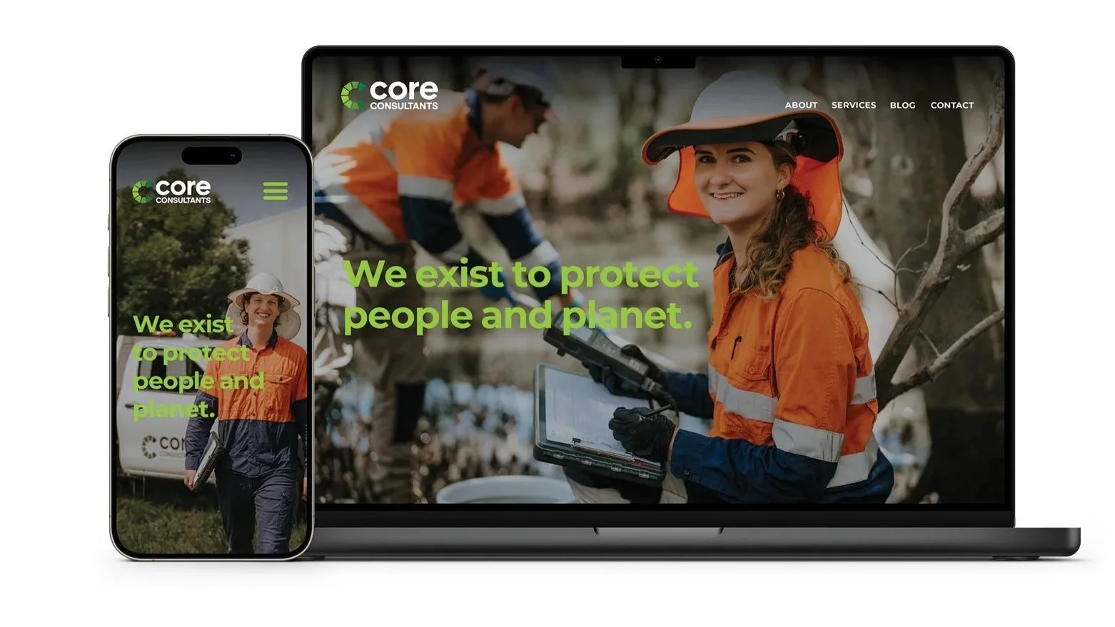
Core Consultants is an employee owned geotechnical and environmental engineering firm headquartered at Coolum Beach with offices in Brisbane and the Gold Coast. After a decade of steady growth, demand was outstripping the team's ability to hire and onboard skilled engineers fast enough to keep up.
Their logo did not say what they actually did. The green palette was hard to apply consistently across reports, proposals, vehicles and PPE. Their identity looked almost identical to their sister company, Core Projects. To anyone outside the business, it was a muddle.
We ran a full discovery workshop with the directors and key team members, then rebuilt the brand from the strategy up. New positioning ("Ground truth. Clear advice."), a new icon that reflects both the engineering rigour and the environmental focus, and a complete design system that engineers can apply themselves without needing a designer over their shoulder. Templates, vehicle livery, PPE, signage, social, website, the lot.
The feedback from the directors and internal team has been overwhelmingly positive, and recruitment activity has continued steadily since launch. The brand now reflects the calibre of work they have always delivered, which makes it a far easier sell to candidates weighing them up against bigger, louder competitors.


Talk Plus Allied Health: a website that does the explaining
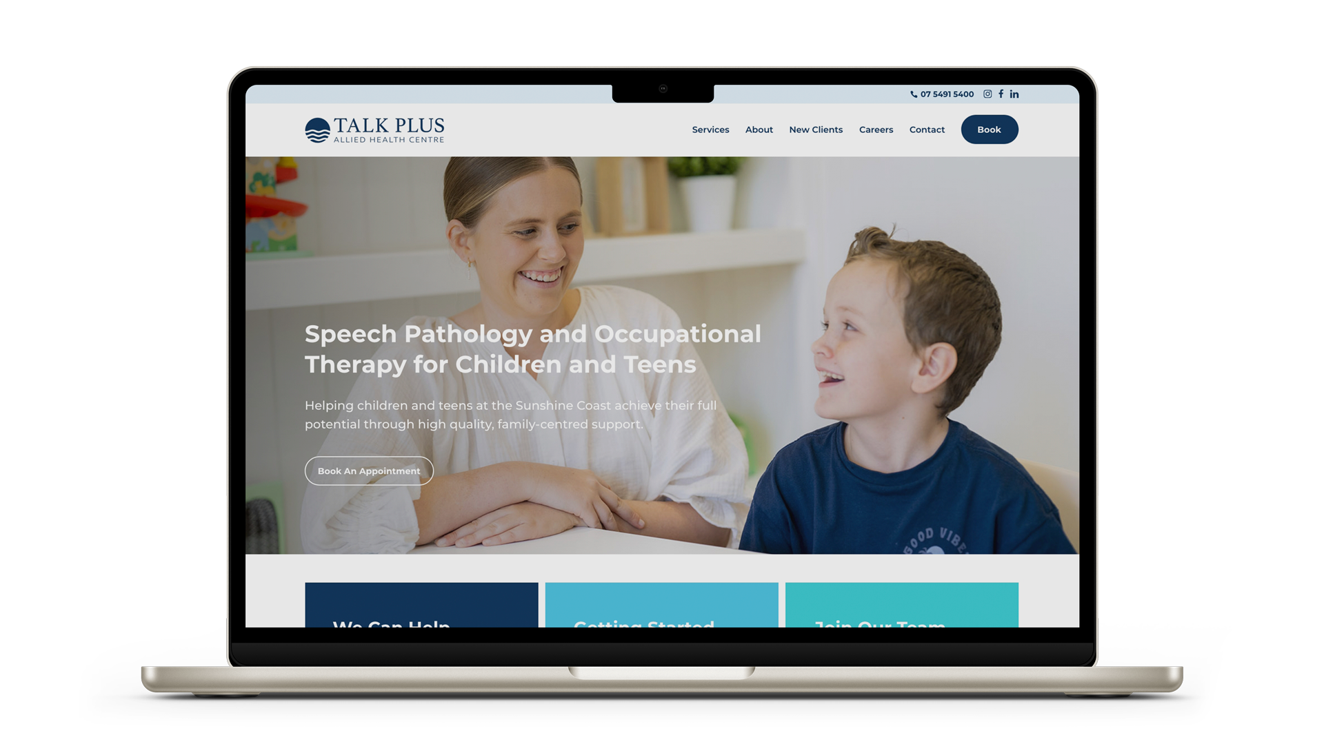
Talk Plus started in 2004 as a family run speech pathology practice and has grown into a full allied health centre on the Sunshine Coast. Allied health is a tough sector to recruit into. The talent pool is small, the work is specialised, and good clinicians have plenty of options.
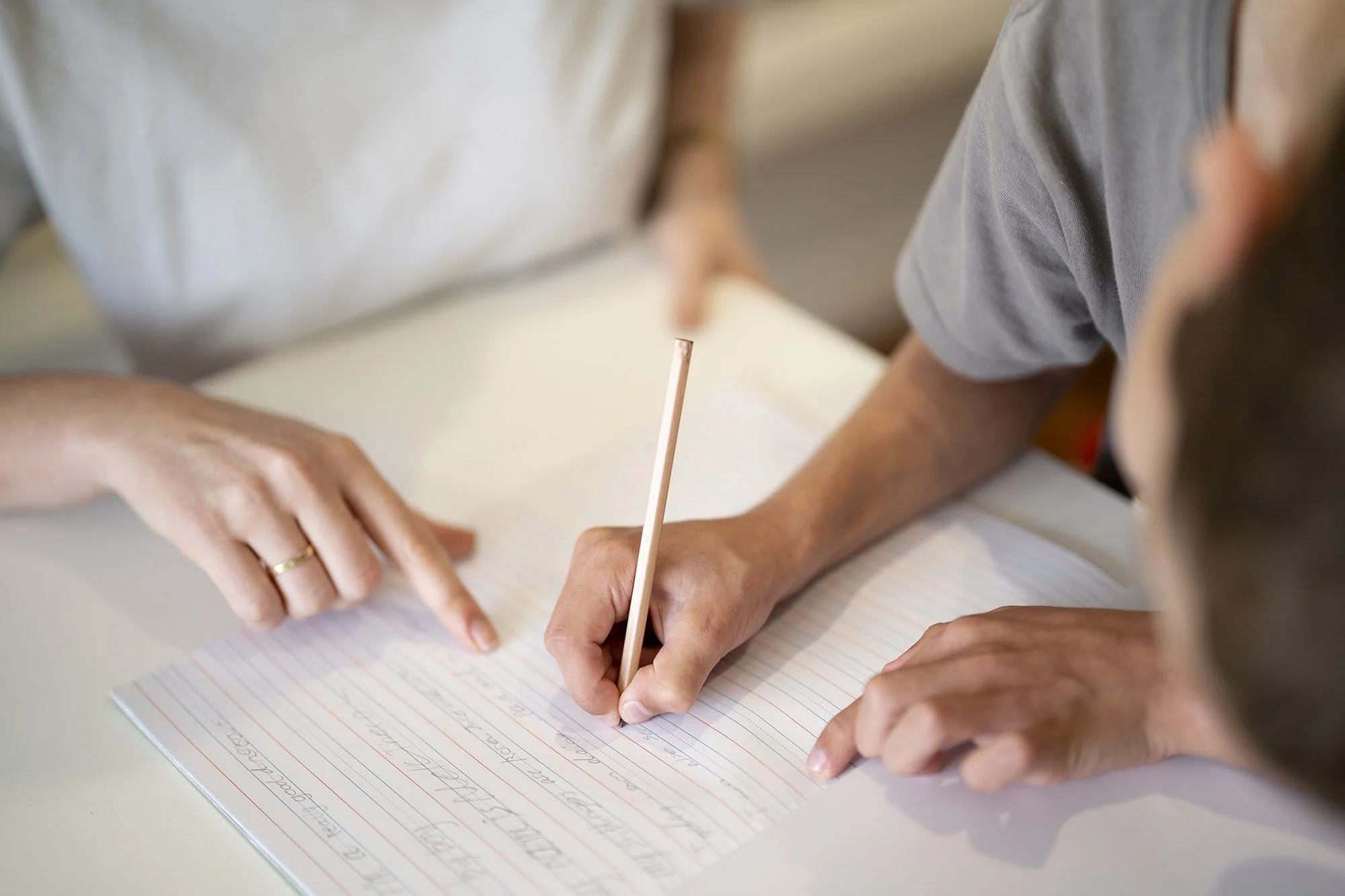
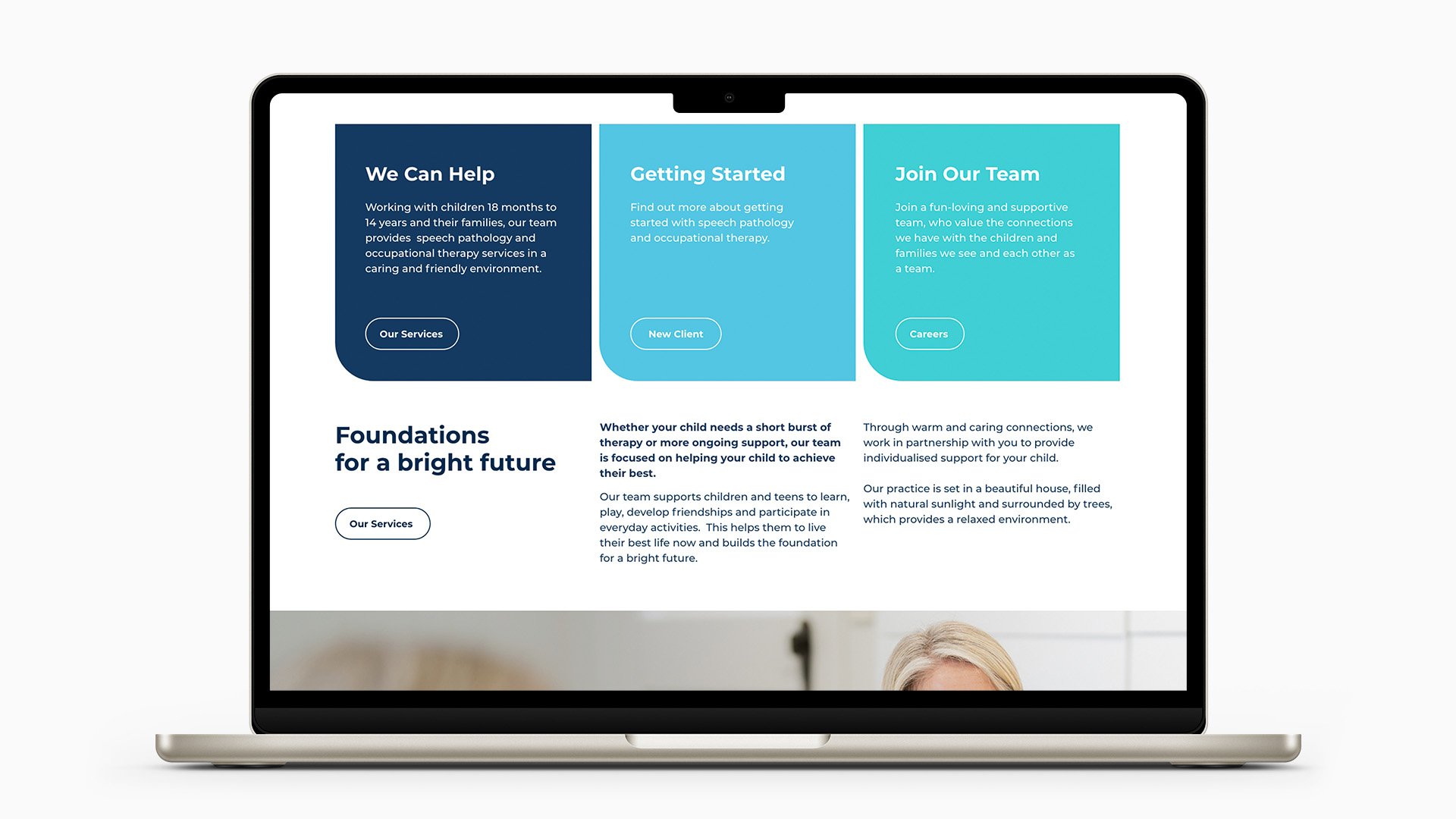
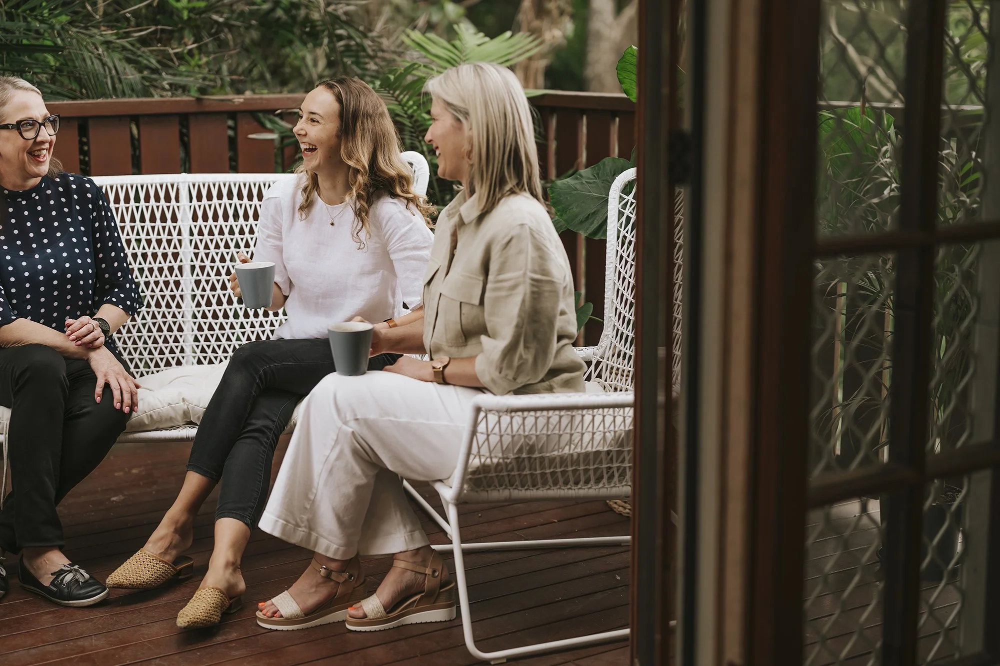
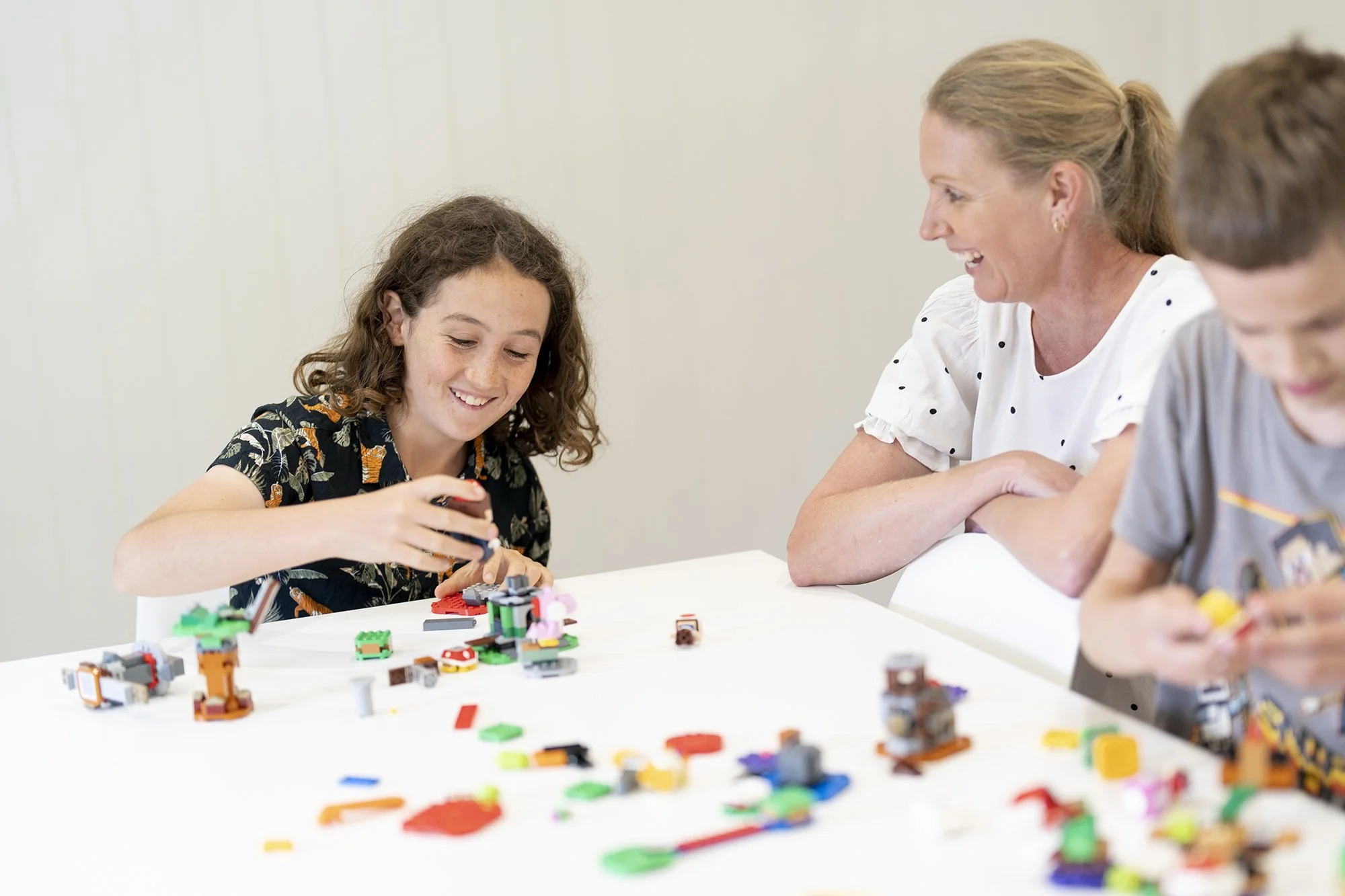
The brief was a new website aimed at parents looking for speech pathology and occupational therapy services. But the careers page mattered just as much. Prospective staff wanted to see the culture, meet the team and understand the practice before they hit "apply".
We built a clean, simple site with custom photography and video of the team and the clinic, clear funding information for parents, and warm, human staff profiles. The careers section was designed to do the same work the founders used to do in person, showing candidates the people, the place and the way the practice runs.
Talk Plus has been consistently recruiting since the new site went live.


Barlow Shelley Engineering: when the logo is older than half the team
Barlow Shelley were either struggling to attract engineers or watching the ones they had walk across the street to competitors who simply looked more polished from the outside. Their logo was a 1990s mark loved by one director and quietly endured by everyone else. The website was no better.
The visual story being told to candidates was that nothing had changed in twenty years. That is a tough sell when the engineer you are trying to recruit is comparing three firms on a Friday night.
A measured brand refresh and a new site lifted their image significantly. The shift was not flashy. It was credible. The kind of update that signals to a prospective hire that this is a firm with momentum, not one running on nostalgia.
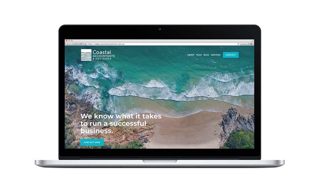
Coastal Accountants & Advisors: the post-COVID senior hire problem
Since COVID, attracting senior accountants has been one of the hardest hires in professional services. The talent pool shrank, remote work changed expectations, and experienced advisors became a candidate's market overnight.
Coolum Accountants used a small refresh as the moment to become Coastal Accountants & Advisors, with a new website, new photography and new copywriting to match the new direction. Reaching beyond the immediate community to attract senior people meant the digital presence had to do more of the introduction than a referral or a sign on the street ever could.
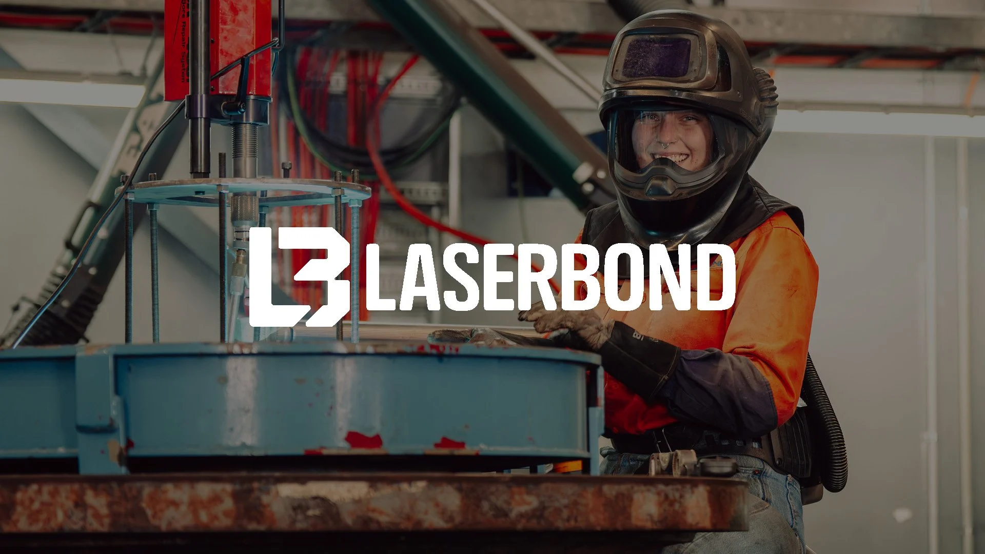
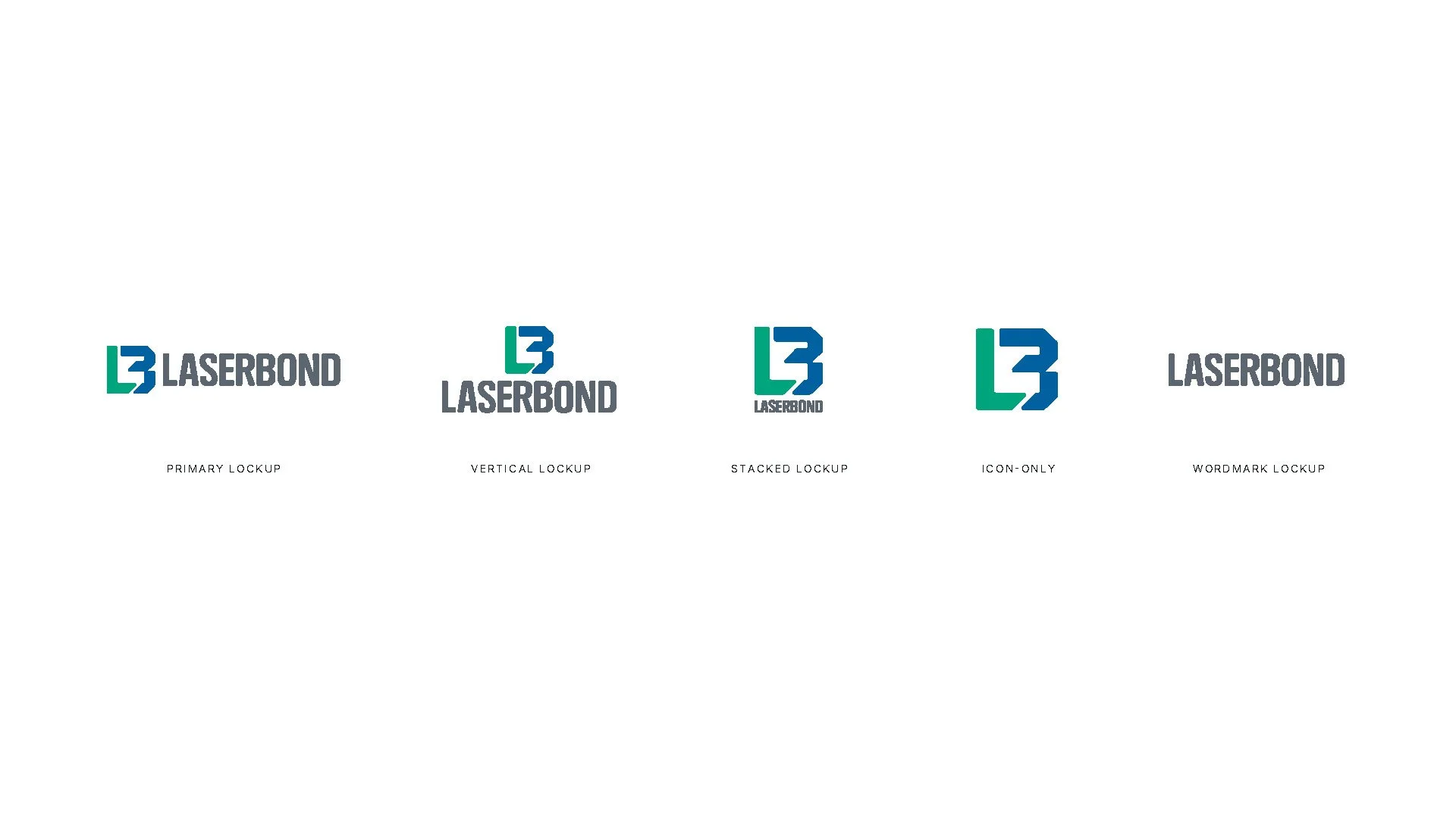

Laserbond: when the brand needs to keep up with the engineering
Laserbond is an ASX-listed Australian engineering business that does extraordinary work. Laser cladding, heat treatment, HVOF spray, and end-to-end repair and surface engineering that can extend the life of high-value components by three to ten times. They sell into mining, steel, oil and gas, desalination, and increasingly defence and international markets.
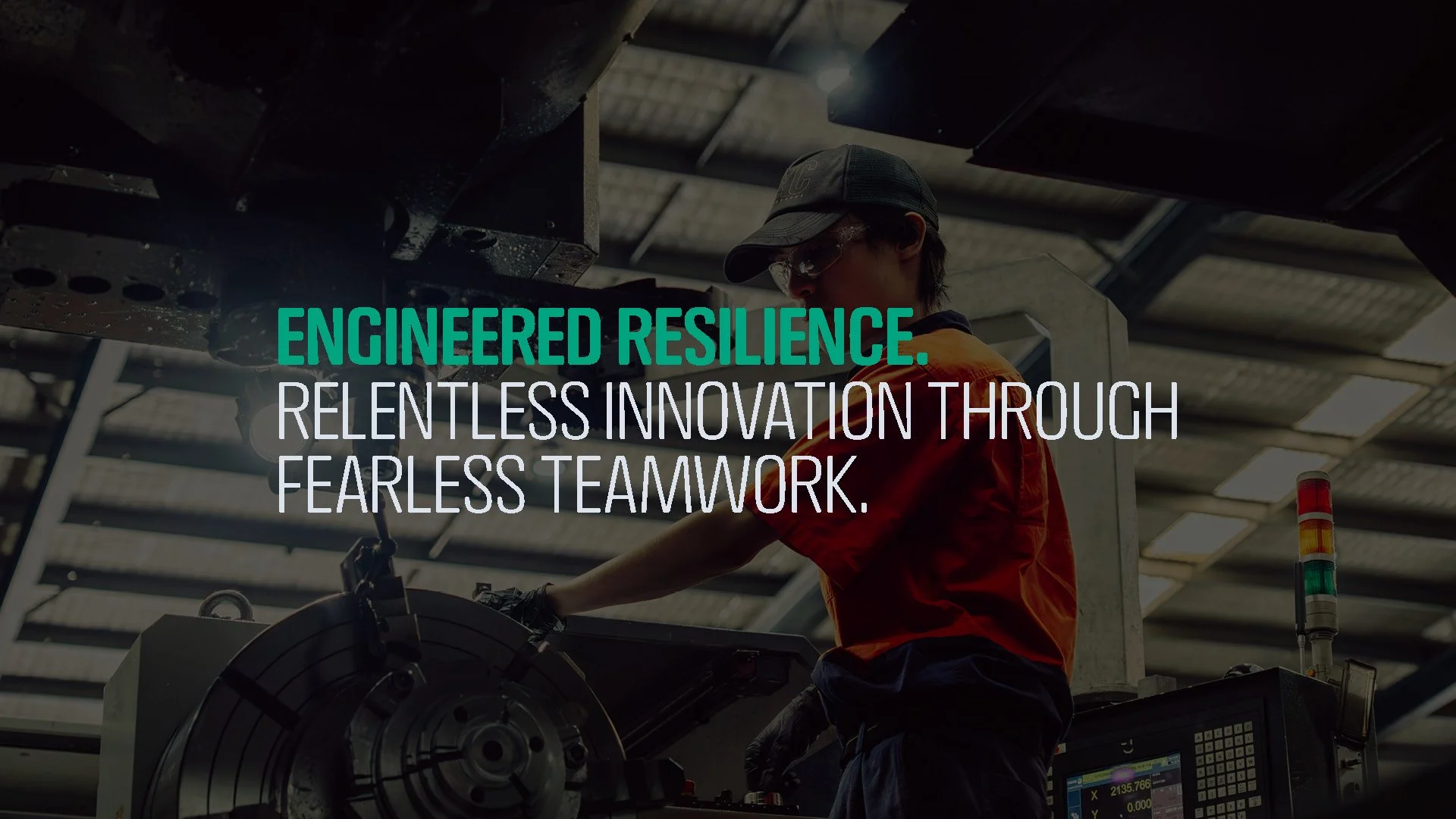
The challenge is that the brand has not kept pace with the engineering. Internally there is a clear ambition for Laserbond to feel world-class and digital first. To be a brand staff are proud to wear and that opens doors at trade shows in Las Vegas as easily as it does on a mine site in Mackay. To attract the kind of engineers, technologists and graduates who want to work somewhere that is genuinely pioneering.
Their full story will be in the Laserbond case study, but the headline is this. When the brand finally matches the capability, recruitment stops being a separate problem. It becomes a by-product of being recognised for what you actually are.

What sits underneath the brand
Here is the harder conversation. A brand can attract a candidate. A culture is what keeps them.
You can dress a business up beautifully, but if the day to day does not match what the website promises, people figure it out within a fortnight. Sometimes within a single team meeting. Once they have figured it out, you are either watching them quietly check out, or you are watching them leave.
So before we ever talk visual identity, we ask two questions.
Why does your business exist, beyond making money?
And the harder one. Why should customers care?
That second question lands oddly in a conversation about staff, but it is the same question. If you cannot answer why a customer should care, you cannot answer why a candidate should care, and you cannot answer why the person already on the payroll should care either. The answer to all three is the same answer.
When those questions go unanswered, it shows up on people. Pride in the work fades. Staff who used to bring ideas to meetings bring silence. Good people scroll job ads at 9pm because what they do has stopped meaning much. It rarely shows up in the numbers until it suddenly does, in a resignation email or a turnover line that reads worse than last year.
The fix is rarely complicated. A monthly Friday lunch that the directors actually turn up to. A genuine thank you when something lands well. A team day that is not a chore. Birthdays, milestones and small wins acknowledged in front of everyone, not buried in a chat thread. Small steady signals that the people here matter beyond the work they put out.
This is true whether you employ five people or five hundred. The bigger you get, the harder it is to hold, which is why it cannot be left to chance.
When the culture is real, the brand becomes the proof of it. The website shows the team because there is a team worth showing. The careers page reads like a place worth working because it is. Candidates feel that before they read a single job description. So do the people you already employ. And so do your clients.
The pattern under all of it
Five clients. Different industries. Same realisation.
A brand is not just how you look to clients. It is the first thing your next hire reads. If your visual identity is a decade old, your website is held together by workarounds, or your story is locked in your founder's head instead of on your home page, you are quietly making it harder for great people to find you and easier for them to choose someone else.
None of these clients started their project with "fix recruitment" written at the top of the brief. But by the end, every one of them had a brand and a digital presence that does part of the hiring work for them. That is the quiet return. Not awards. Not applause. The right people, knocking on the door.
Wondering if your brand is helping or hurting your recruiting / hiring?
If your team is growing, your job ads are falling flat, or you keep losing good people to firms that look more current online, or have better culture, it might be time to take a closer look.