Client Summary:
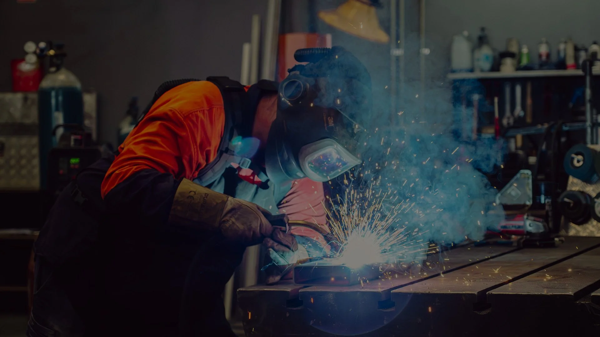
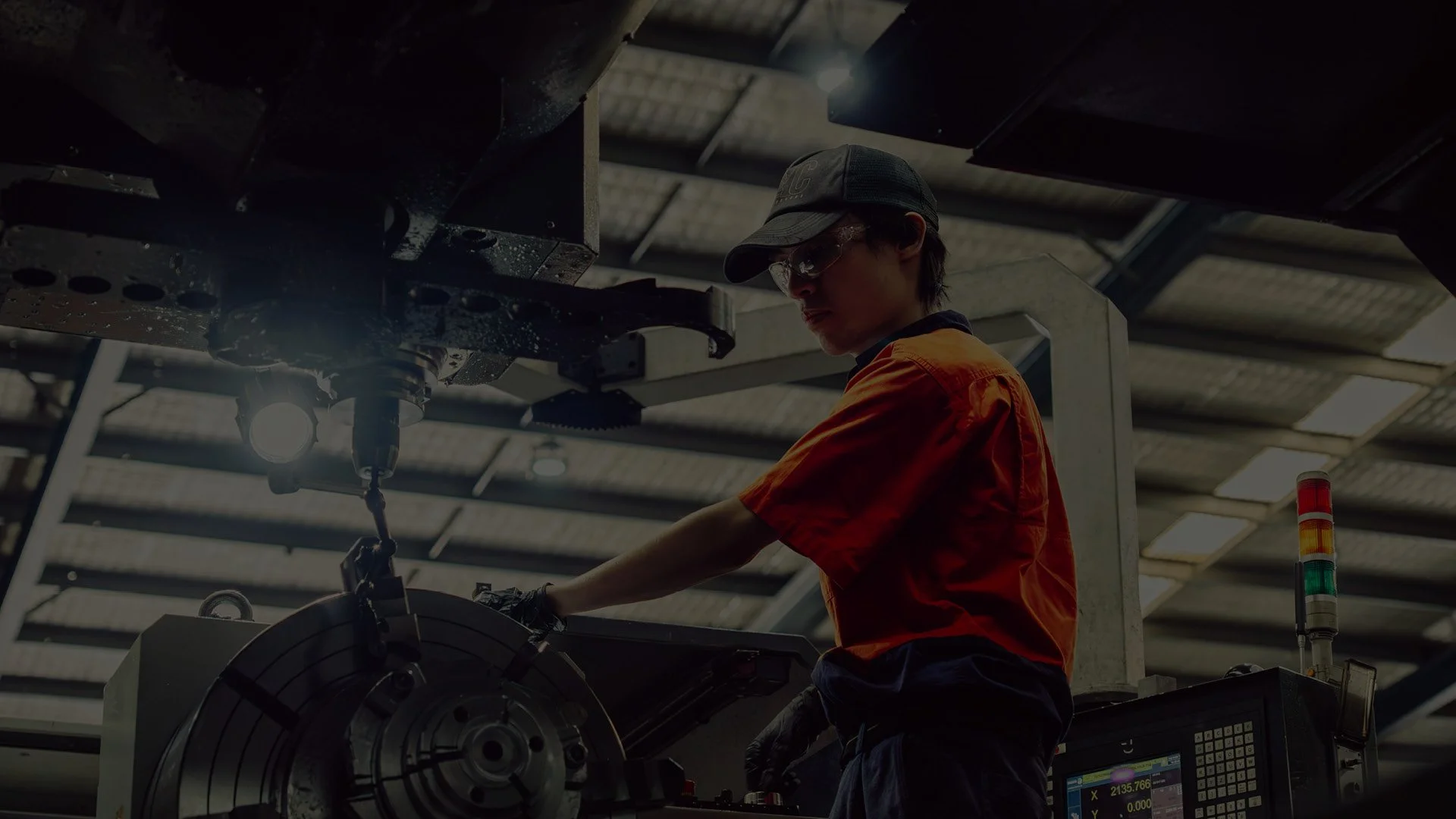
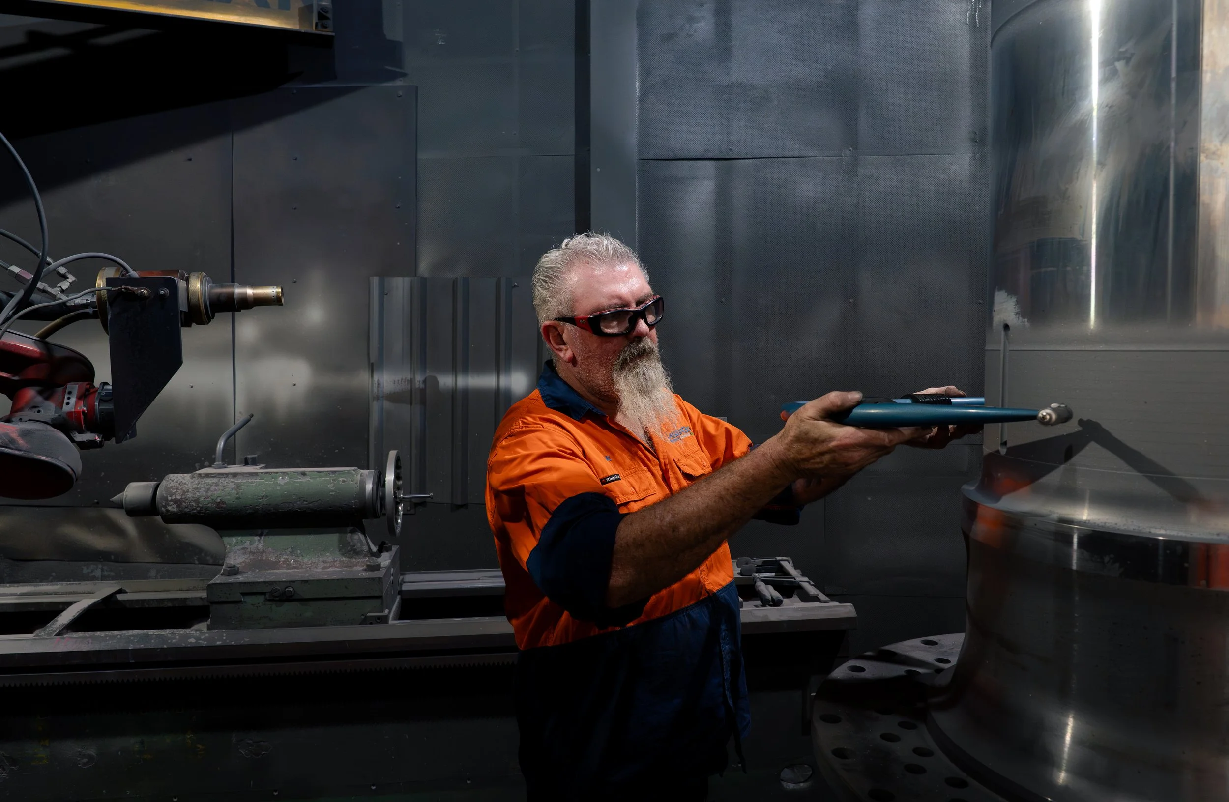
Laserbond is an end-to-end engineering and surfacing solutions business with operations across Sydney, Queensland, Adelaide and Victoria. Founded in 1992 and listed on the ASX, the company partners with industries where critical assets cannot afford to fail, including mining, steel, oil and gas, desalination, defence and emerging green energy. Their work combines laser cladding, HVOF spray, heat treatment, repair and bespoke surface engineering, backed by PhD-led research and lab-tested assurance. In some applications, a Laserbond-treated component can last three to nine times longer than the original.
Mission:
Laserbond engaged The Ageing Sea to lead a full rebrand that finally matched the calibre of the work. The name carried real equity, so much so that some customers had started using it as a verb, but it also narrowed perception. People understood the laser, not the breadth around it. The brief was to break the laser-only mental shortcut without losing the equity in the name, build a modern, confident, world-class identity that could stand up in international markets, and create a flexible system that would hold together across uniforms, vehicles, signage, documents, trade shows and the web.
Deliverables:
Workshop & Planning
Brand Strategy
Visual Identity & Style Guide
Key Messaging, Tagline & Copywriting
Logo Design & Master Assets
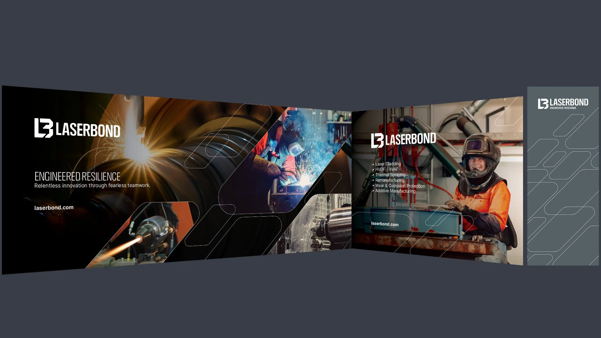
Brochure Suite Design & Production
Email Signatures
Stationery Templates
Website:
laserbond.com.au


'Having worked with Kyle over many years on multiple business rebrands and related projects the team at The Ageing Sea have shown to be 100% reliable. Always a pleasure to work with, on time and consistently delivering outstanding results for our respective budget. You will pay much more from the bigger agencies.'
~ Rob Freeman, CEO
Laserbond
Outcome:
We started with a brand discovery workshop in Sydney with CEO Rob Freeman, Head of Sales and Marketing Keith Allan, and Marketing Manager Loren Vongsarath. Together we unpacked the story behind the business, the three facets of services, products and selective technology sales, the competitive landscape across Australia, North America and Asia, and the friction points that had built up over time. From that conversation, a clear positioning emerged: Laserbond is not selling coatings. Laserbond is selling confidence. Confidence that critical equipment will last, perform and return to service when it is needed.
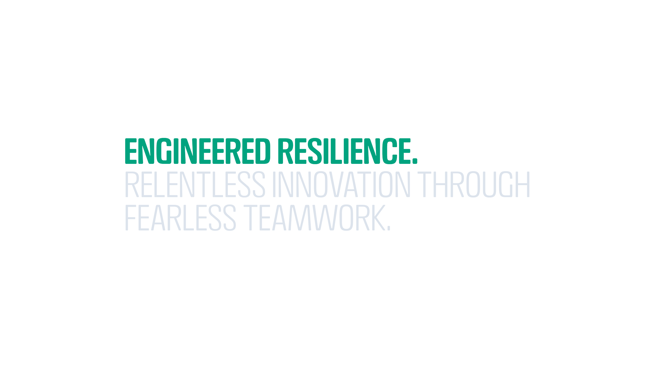
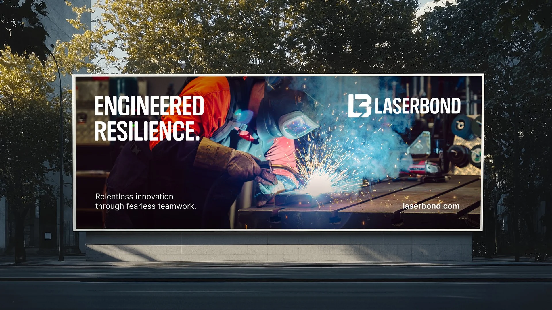
That single idea became the platform for everything that followed. We landed on a new tagline, Engineered Resilience, that captures the promise without leaning on industry jargon, and a brand personality that is confident without the carry-on, practical, direct, and proud of solutions that perform where it counts.
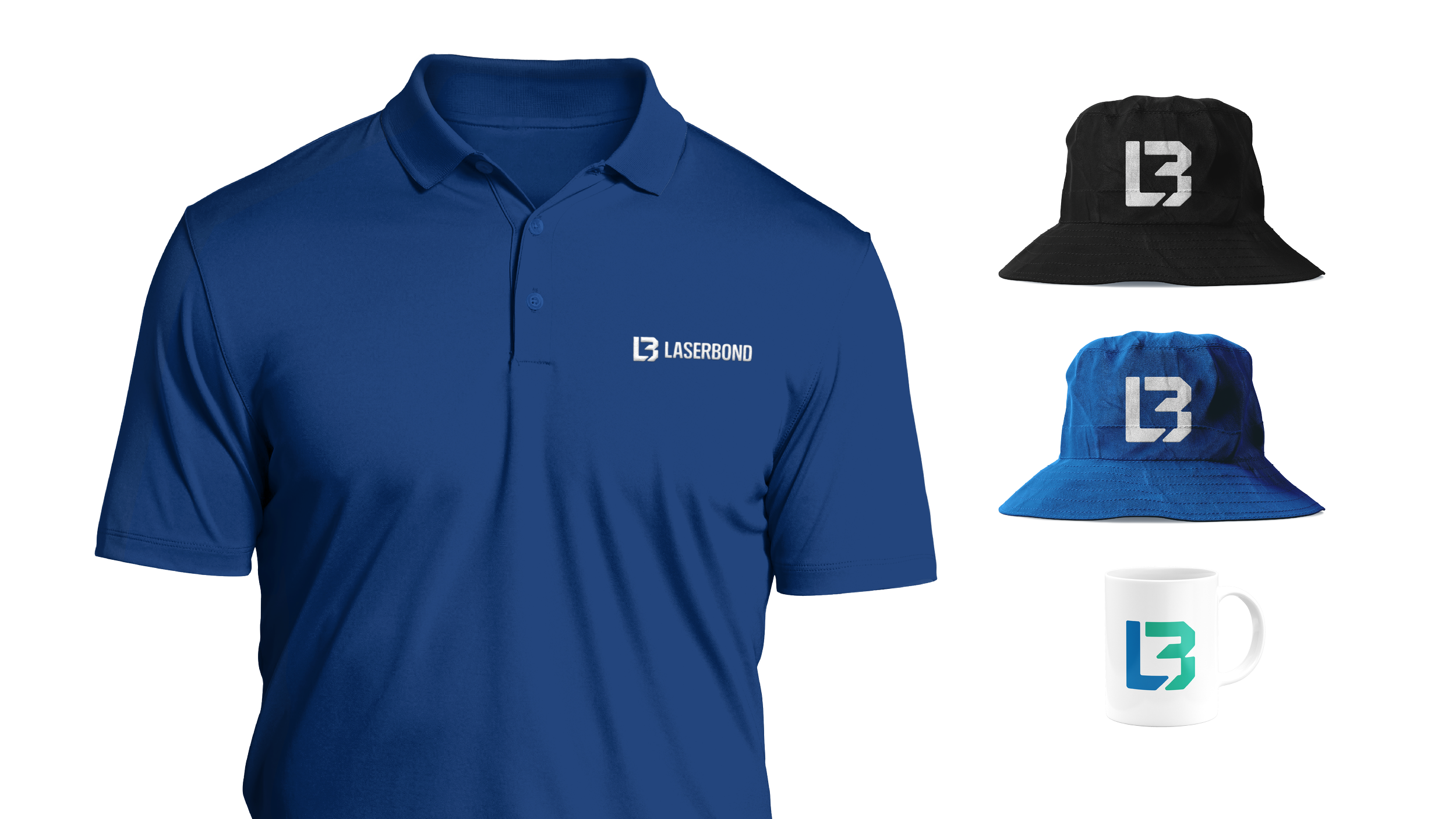
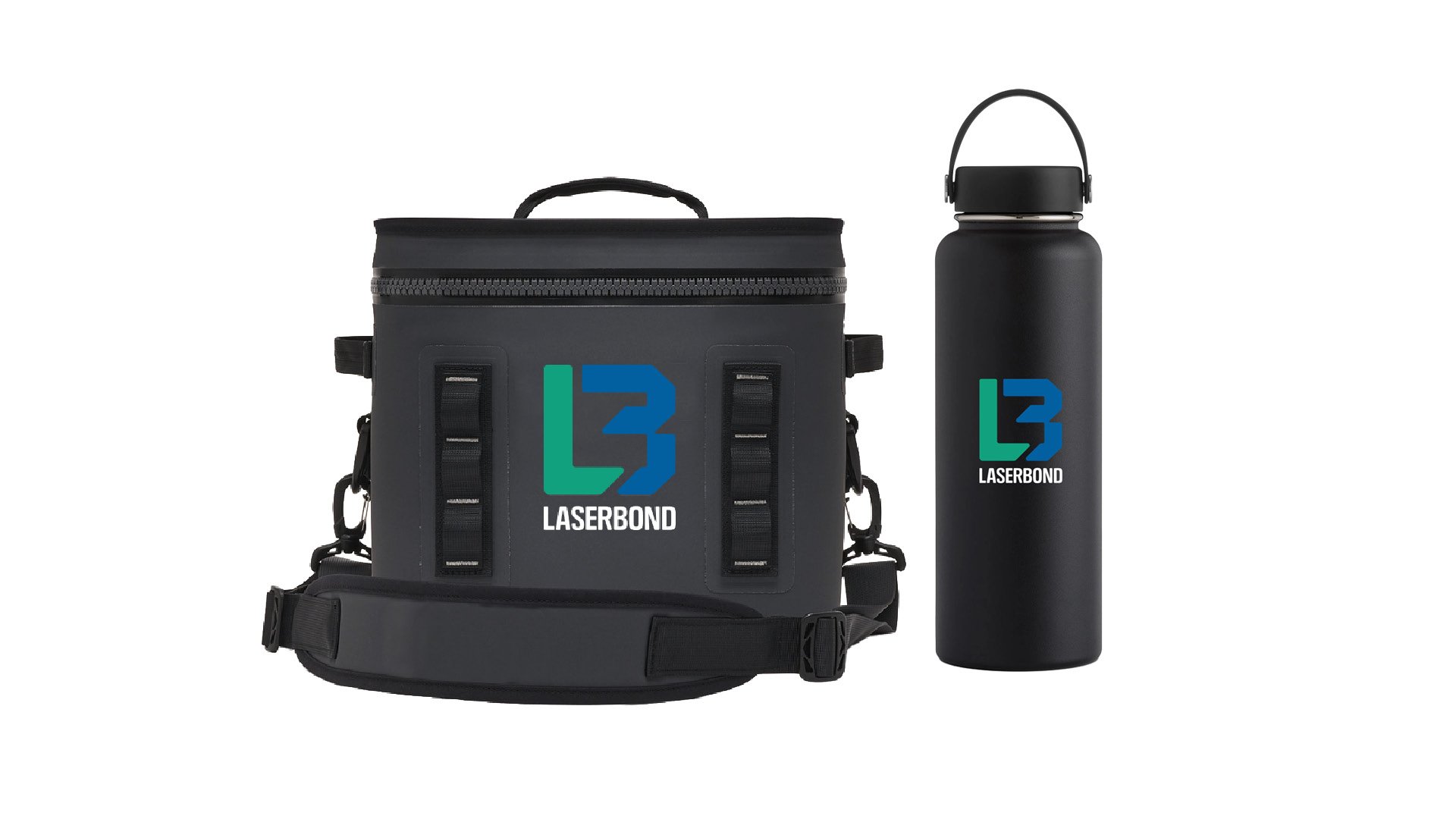
At the heart of the new system is a redrawn icon. Two interlocking geometric forms, a green L and a blue B, that read as a single mark while symbolising the people, ideas and technologies that come together to solve hard problems. The shape is bold and contemporary, the geometry signals precision and technical assurance, and the abstract construction avoids any literal laser imagery, which was important for breaking the laser-only association without losing recognition.
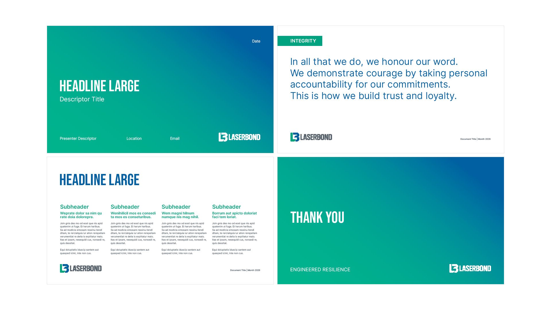
The colour palette retains the equity Laserbond had built in blue, green and grey, but modernises it with a more disciplined system: Precision Blue and Resilience Green carry the brand forward, while Tungsten Grey, Steel and a supporting set of secondary tones provide the range needed across digital, print and large-format applications. Inter became the primary typeface for clarity and digital fluency, paired with Crossfit for impact headlines.
To make the system practical for a business with multiple sites and frequent collateral needs, we built five logo lockups: primary, vertical, stacked, icon-only and wordmark. Each is purpose-built for a different context, from large signage to small embroidery and favicons, so the brand holds together at every scale.
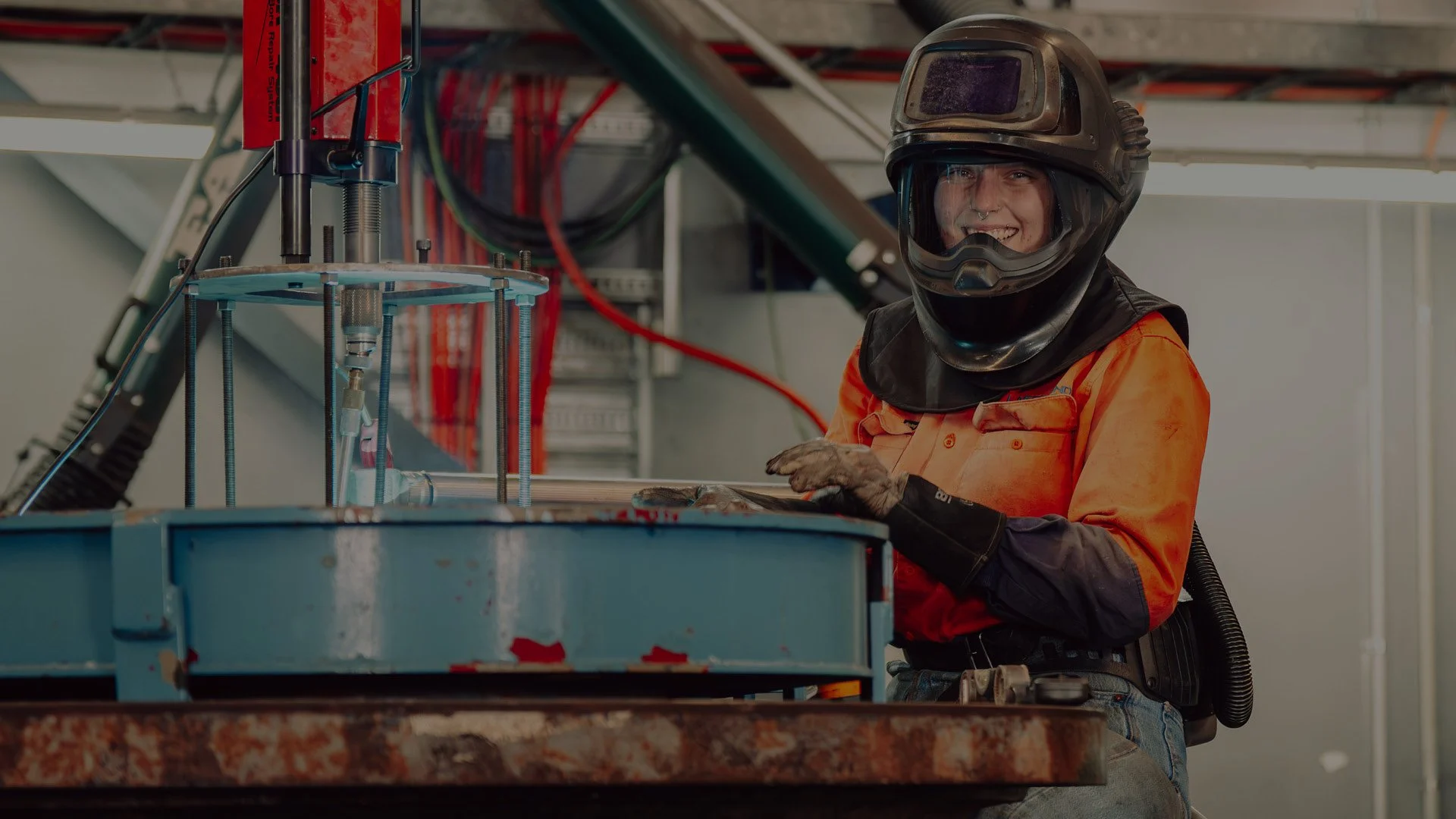
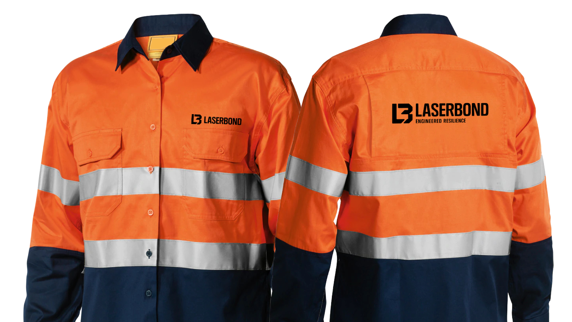
We then rolled the identity out across the full collateral suite. Business cards, letterhead, technical memorandum, PowerPoint templates, email signatures, Teams backgrounds, brochures (40+), social media avatars, uniforms and merchandise, vehicle livery, and outdoor billboard concepts. Each touchpoint was designed to feel like the brand, not just carry the logo.
Finally, we documented the entire system in a 60-page brand style guide that gives the internal team, vendors and partners the standards, rules and references they need to apply Laserbond consistently, every time. The guide is structured to be a working tool rather than a shelf document, with practical guidance on logo usage, colour, typography, photography tone and composition, iconography, and brand collateral templates.
The result is a brand that finally reflects the engineering. Modern, credible, and built to grow with the business as it moves into new markets, attracts the next generation of talent, and continues to prove that critical assets can last longer, perform better, and stay out of landfill.


Service/Credit:
Creative Director: Kyle Nielsen
Senior Designer: Aryna Livadari, Hendri Siman
Junior Designer: Arelle Reginato
Photographer: Myles Freeman
Planning your own rebrand, website refresh or campaign in 2026?
If this project sparked ideas for your business, we’d love to hear about them. We help growing organisations move from “bit pieced together” to cohesive brands, websites and campaigns that feel like you – and work in the real world.